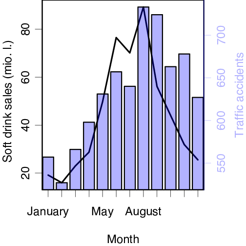
R code used to produce the graph shown below.
library(plotrix)
# Enter data
softdrinks <- c(19.13, 15.94, 22.96, 28.70, 49.75, 76.53,
                70.15, 89.29, 56.12, 44.01, 31.89, 25.51)
accidents <- c(557, 527, 566, 598, 631, 657,
               640, 733, 724, 663, 678, 627)
twoord.plot(1:12, softdrinks, 1:12, accidents, xlab="Month",
            ylab="Soft drink sales (mio. l.)",
            rylab="Traffic accidents",
            lcol="black", rcol=myblue, type=c("l", "bar"), lwd=4,
            xtickpos = 1:12, cex.lab=1, cex.axis=1, cex=mycex,
            axislab.cex=2, mar=c(4,3,0,3),
            xticklab=month.name[1:12])