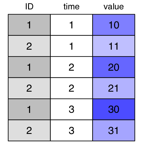
R code used to produce the graph shown below.
par(mar = c(0.5, 2, 3.5, 2))
headers <- c("gray", col.tint("blue", .5), col.tint("blue", .6), col.tint("blue", .7))

cellcol2 <- cbind(rep(c("gray", col.tint("gray", .5)), 3),
                  rep("white", 6),
                  as.vector(cellcol[1:2,2:4]))

colnames(longdf) <- c("ID", "time", "value")


color2D.matplot(longdf,
                show.values = TRUE,
                axes = FALSE,
                xlab = "",
                ylab = "",
                vcex = 3,
                vcol = "black", cellcolor=cellcol2)

axis(3, at = seq_len(ncol(longdf)) - 0.5,
     labels = names(longdf), tick = FALSE, cex.axis = 2.5)