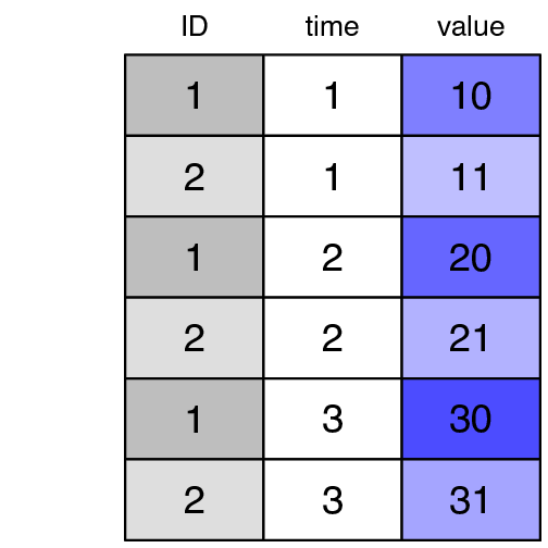
R code used to produce the graph shown below.
library(plotrix)
par(mar = c(0.5, 2, 3.5, 2))
widedf<-data.frame(ID=c(1, 2),
                   time1=c(10,11),
                   time2=c(20,21),
                   time3=c(30,31))
longdf <- melt(widedf, id.vars=c("ID"))
longdf$variable <- c(1,1,2,2,3,3)


headers <- c("gray", col.tint("blue", .5), col.tint("blue", .6), col.tint("blue", .7))
cellcol <- matrix(c(headers, col.tint(headers, .5)), nrow=2, byrow=TRUE)

color2D.matplot(widedf,
                show.values = TRUE,
                axes = FALSE,
                xlab = "",
                ylab = "",
                vcex = 2.5,
                vcol = "black", cellcolor=cellcol)

axis(3, at = seq_len(ncol(widedf)) - 0.5,
     labels = names(widedf), tick = FALSE, cex.axis = 2.2)