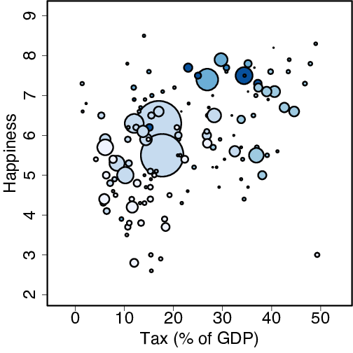
newcols <- brewer.pal(6,"Blues")
with(happiness, symbols(tax, happy, circles=sqrt(population)/8,
        inches=FALSE, bg=newcols[continent],
        xlab="Tax (% of GDP)", ylab="Happiness"))