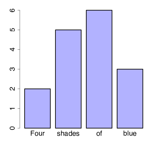
barplot(c(2,5,6,3), col=myblue,
        names.arg=c("Four", "shades", "of", "blue"), ylim=c(0, 6.5))
m <- matrix(c(2,5,6,3),2)
barplot(m, col=c("lightgray", myblue),
        names.arg=c("Group 1", "Group 2"))